Twitter - Concept
As an everyday user of Twitter, I saw opportunities to improve content legibility. This was my vision for a cleaner home timeline in the Twitter app of 2015.
̌
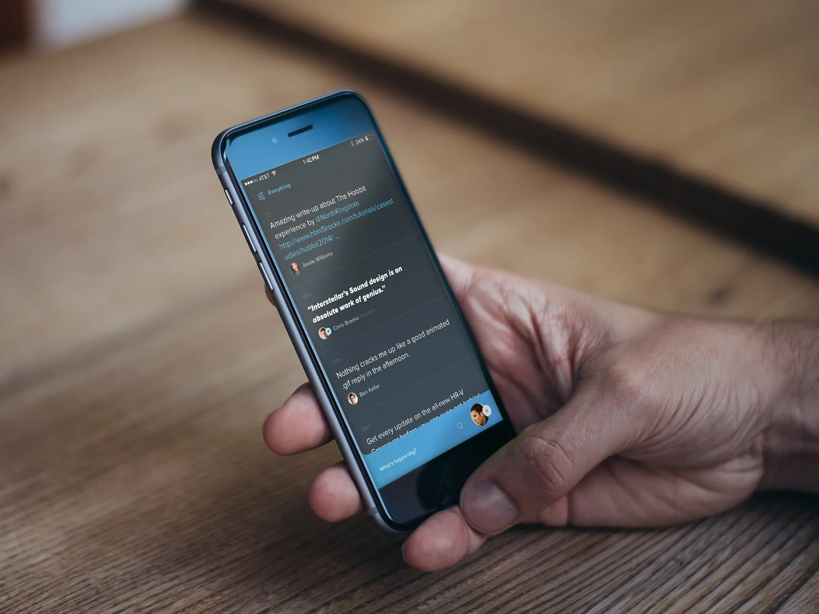
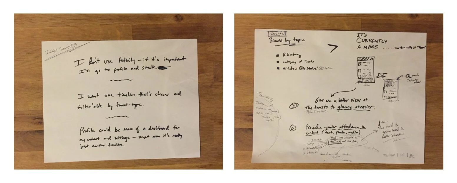
I noticed how noisy my feed was becoming in the current app. It was increasingly harder to keep a pulse on the topics I cared about; and the purpose of each Timeline type (i.e., Home, Discover, and Activity) was difficult to understand and use.
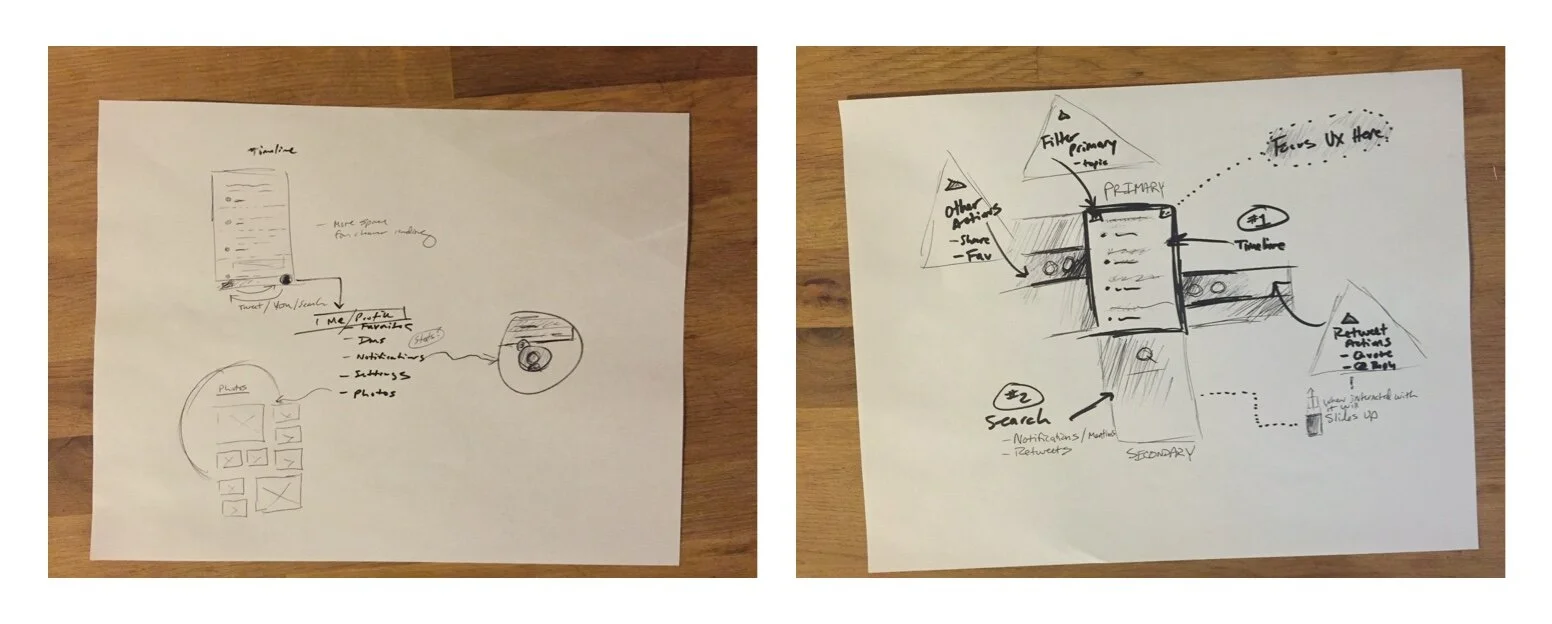
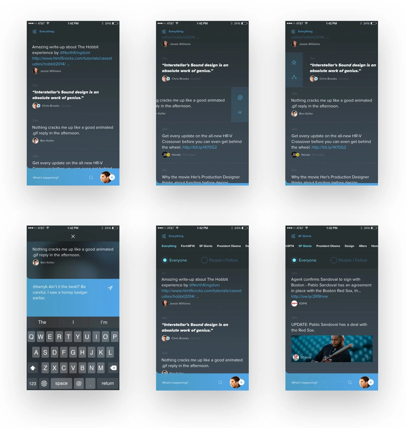
I rethought the primary navigational model for centralized activity and Search. This keeps the main usage in the Timeline and secondary functions always at your thumbs or a simple filter away. I cleaned up the content display for better reading and made actions accessible using simple gestures.
This is an interaction demo I built to evaluate movement through various tasks (e.g., browse, reply, and favorite). This does not include all possible paths the user may take, but it provides a firm grasp of the foundation.
There is more to examine. For example, should conversations be more visually distinguished in the Timeline? Should mentions and other system messages be rolled into a single notification center for the profile?
This concept brings intentional topic/interest engagement to a central Timeline – something I believe Twitter really needs.